
On January 10 1929, a man named Georges Prosper Remi (known by the name Hergé) was writing and illustrating a comic called Tintin for a Belgian newspaper called Le Vingtième Siècle. In 1946, Hergé created Le Journal de Tintin to publish the twenty-four Tintin albums. The comics ran until 1976 when Tintin and the Picaros was published. The style of the comics featured strong black lines, uniformly solid colors, realistic backgrounds, and a similar degree of importance given to every detail in the panel. Shading was rarely used and the comics had a flat, cartoonish appearance.

This style is called ligne claire and was made popular by The Adventures of Tintin, a series of comic books. Hergé had not always illustrated his comic series, which was originally published in 1929, using this style, but the works evolved into this eventual result. Joost Swarte, a Dutch graphic designer known for comics such as Katoen en Pinbal, Jopo de Pojo, and Anton Makassar, first used the term ligne claire in 1977.
Ligne claire is a French term and translates to “clear line” in English because of the emphasis on strong, divisive lines and minimal blending and shading used in lines or images. According to Dafna Pleban in her article Investigating the Clear Line Style in the magazine Comic Foundry, “by forgoing shading with ink, the artist creates a depth of field on the page that brings equal amounts of focus to the background and foreground” (Pleban).
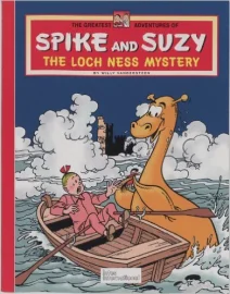
Spike and Suzy, a Belgian comics series written and drawn by Willy Vandersteen and Paul Geerts used the style of ligne claire as well. It features two children named Spike and Suzy who go on adventures, meeting ghosts, monsters, and talking animals. The series originally did not use the ligne claire style, but adapted it after being serialised in Hergé’s magazine, Le Journal de Tintin in 1948. It ran until 1959.
On this cover of The Greatest Adventures of Spike and Suzy: The Lock Ness Mystery, the focus is on Suzy and the Loch Ness monster in the foreground as much as it is on the waves in the background. Every detail of the image is of equal importance.
During the 1960s, ligne claire began to fade out in favor of more modern illustrative works; however, during the 1980s the style resurged. It is often used to evoke a sense of nostalgia. Rampokan Java is a graphic novel by Peter van Dongen in 1998. It chronicles the struggle of the colony of Indonesia to become free from The Netherlands. It uses the style of ligne claire to purposefully draw connections between itself and The Adventures of Tintin “to intentionally invoke the questionable colonial content of old Tintin comics” (Pleban). While the style is being used into more modern works, the sense of nostalgia it evokes is still present.
REFERENCES
McCloud, S. (1994). Understanding Comics: The Invisible Art. New York: Harper Perennial.
Pleban, D. (2006, November 7). Investigating the Clear Line Style. Comic Foundry.
